Monday, April 30, 2012

Web Parts

WebPart Life Cycle
OnInit: This method handles initialization of the control.
OnLoad: This event handles the Load event. This is also used for initialize the control but is not intended for loading data or other processing functionality.
CreateChildControls: This is the most popular event in web part life cycle. This creates any child controls. So if you are adding any control to display then you have to write in this method.
EnsureChildControls: This method ensures that CreateChildControls has executed. EnsureChildControls method must be called to prevent null reference exceptions.
SaveViewState: View state of the web part saved.
OnPreRender: This method handles or initiates tasks such as data loading that must complete before the control can render.
Page.PreRenderComplete: The page fires the PreRenderComplete event after all controls have completed their OnPreRender methods.
Render: This method is used to render everything.
RenderContents: Renders the contents of the control only, inside of the outer tags and style properties.
OnUnload: Performs the final cleanup.

Visual Web Part Limitations

Starting in Visual Studio, you can add visual web parts to sandboxed SharePoint solutions and farm solutions. However, visual web parts have the following limitations:
  • Visual web parts don't support replaceable parameters. For more information, see Replaceable Parameters.
  • User controls or visual web parts can't be dragged and dropped or copied onto visual web parts. This action causes a build error.
  • Visual web parts don't directly support SharePoint server tokens such as $SPUrl. For more information, see "Token Restrictions in Sandboxed Visual Web Parts" in the topic Troubleshooting SharePoint Solutions.
  • Visual web parts in a sandboxed solution occasionally get the error, "The sandboxed code execution request was refused because the Sandboxed Code Host Service was too busy to handle the request." For more information about this error, see this post in the SharePoint Developer Team Blog.
  • Server-side JavaScript debugging isn't supported in Visual Studio, but client-side JavaScript debugging is supported.
    Although you can add inline JavaScript to a server-side markup file, debugging isn't supported for breakpoints added to the markup. To debug JavaScript, reference an external JavaScript file in the markup file, and then set the breakpoints in the JavaScript file.
  • Debugging of inline ASP.NET code must be done in the generated code file instead of in the markup file.
  • Visual web parts don't support the use of the <@ Assembly Src= directive.
  • SharePoint web controls and some ASP.NET controls aren't supported in the SharePoint sandboxed environment. If unsupported controls are used on a visual web part in a sandboxed solution, the error, "The type or namespace name 'Theme' does not exist in the namespace 'Microsoft.SharePoint.WebControls'" appears.
 
 
Good Example:
 
 
using System;
using System.ComponentModel;
using System.Web;
using System.Web.UI;
using System.Web.UI.WebControls;
using System.Web.UI.WebControls.WebParts;
using Microsoft.SharePoint;
using Microsoft.SharePoint.WebControls;
using System.Data;

namespace SharepointTraingSolution.BasicWebPart
{
    [ToolboxItemAttribute(false)]
    public class BasicWebPart : WebPart
    {
        private DataGrid grid;
        private static string verbText = "Show Managers Only";
        private Label errorMessage = new Label();
        protected string xmlFilePath;

        [Personalizable(PersonalizationScope.Shared), WebBrowsable(true),
         WebDisplayName("Path to Employee Data File"),
         WebDescription("Location of the XML file that contains employee data")]
        public string DataFilePath
        {
            get
            {
                return xmlFilePath;
            }
            set
            {
                xmlFilePath = value;
            }
        }
        public override WebPartVerbCollection Verbs
        {
            get
            {
                WebPartVerb customVerb = new WebPartVerb("Manager_Filter_Verb",
                    new WebPartEventHandler(CustomVerbEventHandler));
                customVerb.Text = verbText;
                customVerb.Description = "Shows only employees that are managers";
                WebPartVerb[] newVerbs = new WebPartVerb[] { customVerb };
                return new WebPartVerbCollection(base.Verbs, newVerbs);
            }
        }
        protected void CustomVerbEventHandler(object sender, WebPartEventArgs args)
        {
            int titleColumn = 2;
            foreach (DataGridItem item in grid.Items)
            {
                if (item.Cells[titleColumn].Text != "Manager")
                {
                    if (item.Visible == true)
                    {
                        item.Visible = false;
                    }
                    else
                    {
                        item.Visible = true;
                    }
                }
            }
            if (verbText == "Show Managers Only")
            {
                verbText = "Show All Employees";
            }
            else
            {
                verbText = "Show Managers Only";
            }
        }
       
        protected override void CreateChildControls()
        {
            // Define the grid control that displays employee data in the Web Part.
            grid = new DataGrid();
            grid.Width = Unit.Percentage(100);
            grid.GridLines = GridLines.Horizontal;
            grid.HeaderStyle.CssClass = "ms-vh2";
            grid.CellPadding = 2;
            grid.BorderWidth = Unit.Pixel(5);
            grid.HeaderStyle.Font.Bold = true;
            grid.HeaderStyle.HorizontalAlign = HorizontalAlign.Center;
            // Populate the grid control with data in the employee data file.
            try
            {
                DataSet dataset = new DataSet();
                dataset.ReadXml(xmlFilePath, XmlReadMode.InferSchema);
                grid.DataSource = dataset;
                grid.DataBind();
            }
            catch (Exception x)
            {
                errorMessage.Text += x.Message;
            }
            // Add control to the controls collection of the Web Part.
            Controls.Add(grid);
            Controls.Add(errorMessage);
            base.CreateChildControls();
        }
      
       
        protected override void Render(HtmlTextWriter writer)
        {
            base.Render(writer);
            writer.Write("<HTML><HEAD><BODY><TABLE BORDER=1><TR><TD>RAJ SHARMA</TD></TR><TD>RAJ SHARMA</TD></TR><TD>RAJ SHARMA</TD></TR></TABLE></BODY></HEAD></HTML>");
        }
    }
}
 
<?xml version="1.0" encoding="utf-8" ?>
    <employees xmlns="http://schemas.microsoft.com/vsto/samples">
       <employee>
           <name>David Hamilton</name>
           <hireDate>2001-05-11</hireDate>
           <title>Sales Associate</title>
       </employee>
       <employee>
           <name>Karina Leal</name>
           <hireDate>1999-04-01</hireDate>
           <title>Manager</title>
       </employee>
       <employee>
           <name>Nancy Davolio</name>
           <hireDate>1992-05-01</hireDate>
           <title>Sales Associate</title>
       </employee>
       <employee>
           <name>Steven Buchanan</name>
           <hireDate>1955-03-04</hireDate>
           <title>Manager</title>
       </employee>
       <employee>
           <name>Suyama Michael</name>
           <hireDate>1963-07-02</hireDate>
           <title>Sales Associate</title>
       </employee>
    </employees>


Understanding SharePoint Delegate Control

8 December, 2010 (15:25) | SharePoint 2010 - Object Model | By: G Vijai Kumar
In this article I’m going to explain about delegate control, before we jump start into the technical talk we will understand first what is the meaning of Delegates
As I believe most of us we know that in general delegates are also called as ambassadors, diplomats, representatives etc.
A delegate having high ranks has most importance for example ranks like 1, 2, 3. Rank1 delegate officer has most significant role than rank2 delegate officer.
There can be so many delegate officers or ambassadors serving for Country X for example: A delegate officer may look after the relations between Country X and Country A, another delegate ambassador may look after the relations between Country X and Country B, even some times the delegate officers have to visit to the Country A or Country B depending upon the call.
Now we will speak real technical vocabulary of delegates, SharePoint has a couple of delegate controls like
AdditionalPageHead
GlobalSiteLink0
GlobalSiteLink1
GlobalSiteLink2
PublishingConsole
QuickLaunchDataSource
SmallSearchInputBox
TopNavigationDataSource
Apart from the above controls, we can also create our own custom delegate controls
The XML schema for delegate control is below:
1
2
3
<?xml version="1.0" encoding="utf-8" ?> <Elements xmlns="http://schemas.microsoft.com/sharepoint/">
 <Control Id="SmallSearchInputBox" Sequence="100" Url="/templates/mysearchcontrol.ascx"/>
</Elements>
In the above schema you can view the properties for the delegate control as Control Id, Sequence and URL. We identify the delegate controls based on Control Id, Sequence number. The Sequence number defines the rank of the delegate, URL describes the source location of the control.
As we discussed already above that “Delegates having high ranks has most importance” in the same way delegate control who’s Sequence id is less has most significant role in SharePoint site and will render on the site as first preference.
Also we have discussed that “some times the delegate officers have to visit to the Country A or Country B depending upon the call” in the same way if we have custom delegate control deployed on site and activated, the least Sequence control will load on site depending upon the user action.
What is the use of delegate control?
Using the delegate control a developer can customize the SharePoint site controls without editing or even touching the master page.
Note: We are not customizing the existing (default) delegate control but we are creating our own control loading onto the SharePoint site.
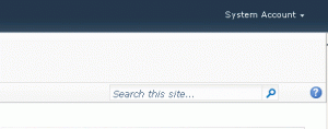
Let’s suppose assume one scenario, if we want to customize the SharePoint search box (by default SharePoint 2010 site has got input search box with one textbox and one button beside) see figure 1
Figure 1 - SharePoint 2010 Default Search Box
Now I will try to customize the default search box, the requirement is to display the search box with scope drop down list, and also customizing the search button image with a arrow image button.
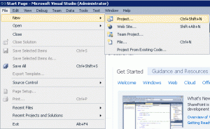
First open Visual Studio 2010 and click New > Project see figure 2
Figure 2 - Creating New Visual Studio 2010 Project
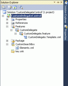
After project got created, I have deleted the not in use file (you can keep it there won’t be any problem if you don’t delete) because of maintaing clean solution I have removed user control, webpart related files see figure 3
Figure 3 - Solution Explorer File Structure
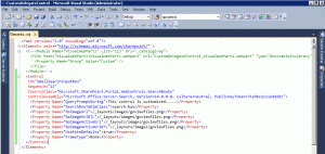
Then add the following code in Elements.xml file
1
2
3
4
5
6
7
8
9
10
11
12
13
14
15
16
17
18
19
20
21
22
<?xml version="1.0" encoding="utf-8"?>
  <!--<Module Name="VisualWebPart1" List="113" Url="_catalogs/wp">
    <File Path="VisualWebPart1\VisualWebPart1.webpart" Url="CustomDelegateControl_VisualWebPart1.webpart" Type="GhostableInLibrary" >
      <Property Name="Group" Value="Custom" />
    </File>
  </Module>-->
  <Control
     Id="SmallSearchInputBox"
     Sequence="23"
     ControlClass="Microsoft.SharePoint.Portal.WebControls.SearchBoxEx"
     ControlAssembly="Microsoft.Office.Server.Search, Version=14.0.0.0, Culture=neutral, PublicKeyToken=71e9bce111e9429c">
    <Property Name="QueryPromptString">This control is customized.....</Property>
    <Property Name="SearchBoxTableClass">search-box</Property>
    <Property Name="GoImageUrl">/_layouts/images/goviewfiles.png</Property>
    <Property Name="GoImageUrlRTL">/_layouts/images/goviewfiles.png</Property>
    <Property Name="GoImageActiveUrl">/_layouts/images/goviewfiles.png</Property>
    <Property Name="GoImageActiveUrlRTL">/_layouts/images/goviewfiles.png</Property>
    <Property Name="UseSiteDefaults">true</Property>
    <Property Name="FrameType">None</Property>
  </Control>
</Elements>
In the Element.xml file I have commented the Module section see figure 4
Figure 4 - Custom Delegate Control Element.xml file
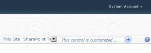
Now we are almost done, try to build, deploy and activate the feature which will result in change of SharePoint default search box with your customized control on fly without modifying the master page see figure 5
Figure 5 - SharePoint 2010 Custom Search Input Box
At run time, this control accepts the union of control elements declared at the server farm, Web application, site collection, and Web site levels. The control that has the lowest sequence number is added to the control tree by means of the DelegateControl. In the case of a sequence tie, the order of controls is arbitrary.
The sequence number of the DelegateControl can be used to integrate a portal search control in SharePoint Foundation. The default search control has a sequence number of 100, and a portal search, for example, could be activated at the site collection level with a sequence number of 50. In this way, SharePoint Foundation replaces the default search control with the portal search control in all places where the search control is invoked.

A delegate control is not inherently designable because it is ignorant of the actual control that gets instantiated inside it. The best it can do is render the design-time HTML of the chosen control for the particular instance. At best, the designer provides an option to "hardcode" the control, meaning replace the SharePoint:DelegateControl with the current control that is being returned via the Features infrastructure. The developer can then customize the control.

How to: Customize a Delegate Control

This example shows the basic process of creating and implementing a delegate control. The delegate control resides in the AdditionalPageHead control on the page. It registers some ECMAScript (JavaScript, JScript) on the page.

To build the delegate control

  1. Start SharePoint development tools in Microsoft Visual Studio 2010.
  2. On the File menu, point to New, and then click Project.
  3. In Project Types, under Visual Basic or C#, select Empty SharePoint Project.
  4. Type EcmaScriptDelegate as the project name. Click OK.
  5. In the SharePoint Customization Wizard, choose Deploy as a farm solution. Click Finish.
  6. In the Solution Explorer, right-click the EcmaScriptDelegate project. Select Add and then New Item.
  7. In the Add New Item dialog box, click the Code group and choose the Class template. Type EcmaScriptDelegateControl as the Name and then click Add.
  8. Next, you must add a reference to System.Web. In the Solution Explorer, right-click the References folder and select Add Reference. In the Add Reference dialog, click the .NET tab and find System.Web in the list. Click OK.
  9. In the EcmaScriptDelegateControl file that is displayed, add the following using statement.
    using System.Web.UI.WebControls;
    
  10. Change the base class of EcmaScriptDelegateControl to WebControl by modifying the following line.
    class EcmaScriptDelegateControl : WebControl
    
  11. Override the OnLoad method by adding the following code.
    protected override void OnLoad(EventArgs e)
    {
      base.OnLoad(e);
    }
    
    
  12. Inside the OnLoad method, add the following code to put JavaScript on the page.
      string helloAlert = "alert('Hello, world!');";
      this.Page.ClientScript.RegisterClientScriptBlock(this.GetType(), "popup", helloAlert, true);
    
    
Now, you have built the delegate control for the project. Next, you will create the Feature to deploy the control.

To create a Feature to deploy the control

  1. In the Solution Explorer, right-click the EcmaScriptDelegate project and select Add and then New Item.
  2. In the Add New Item dialog box, choose the Empty Element template and type EcmaScriptDelegateFeature as the Name. Click Add.
  3. Insert the following XML inside the Elements element. The Id attribute identifies the delegate where the control is rendered. The ControlAssembly and ControlClass attributes are unique to your control. For more information about how to find the full assembly name, see How to: Create a Tool to Get the Full Name of an Assembly.
    <Control Id="AdditionalPageHead" ControlAssembly="EcmaScriptDelegate, Version=1.0.0.0, Culture=neutral, PublicKeyToken=public key token" ControlClass="EcmaScriptDelegate.EcmaScriptDelegateControl">
    
    
You now have both the control and the Feature you need to deploy the control. Controls require a SafeControl entry in the web.config file in order to run on the page. The following procedure adds a SafeControl entry for your control.

To add a SafeControl entry

  1. In the Solution Explorer, click EcmaScriptDelegateFeature and click ... in the Safe Control Entries property.
  2. Click Add in the Safe Control Entries dialog.
  3. In the Properties box, ensure that the Namespace property is the correct value. This is the namespace of your control. Also, ensure that the Safe property is set to true. Click OK.
Now that the SafeControl entry is added, you can deploy the solution.

To deploy and test the delegate control

  1. Press F5 to run the solution.
  2. When the page loads, a dialog box appears that says Hello, world!. This is the script that the delegate control has added to the page.


Web Parts in SharePoint Foundation

Web Parts are server-side controls that run inside the context of site pages in Microsoft SharePoint Foundation. There are many Web Parts available by default, and you can also build your own custom Web Parts in SharePoint Foundation. They are editable and configurable by users. Web Parts let users add functionality to a site page by simply putting them on the page. SharePoint Foundation includes many default Web Parts. In addition, you can build your own Web Parts.

Types of webparts


There are two types of webparts available the first is Asp.net webparts and other is sharepoint web. the Asp.net inherited from system.web.UI.webcontrols.webparts and sharepoint webpart inherited from system.sharepoint.webparts.webpart. it uses Microsoft.SharePoint.dll and ASP.net uses System.Web.dll.

Asp.net webparts can be used to both enviroment .net as well as sharepoint. while sharepoint webparts can be used in sharepoint enviroment.

Custom Web parts

The term customization implies that changes are seen by all site members. Individual users can further personalize Web Parts page by adding, reconfiguring, and removing Web Parts. The term personalization implies that these changes are seen only by the user who made them. A site owner or a site member who has the appropriate permissions can customize Web Parts page by using a browser or by using Microsoft SharePoint Designer to add, reconfigure, or remove a Web Part.

Custom web parts used to provided the following facitlities..


Connectable Web Parts

Connectable web parts is the special type of webparts which provides the connection between two or more web parts, connectable web parts exchange the information to each other, there are some kind of prents child relationship. they provides the interface to consume and consumer interface to exchange the information.

Adding a web part property
after adding hte web part add a new property which is used to personalize the web part to the indiviudual user. It apears in the tools to edi


  • Create custom properties that you can display and modify in the user interface.
  • Improve performance and scalability. A compiled custom Web Part runs faster than a script.
  • Implement proprietary code without disclosing the source code.
  • Secure and control access to content within the Web Part. Built-in Web Parts enable any users who have the appropriate permissions to change content and alter Web Part functionality. With a custom Web Part, you can determine the content or properties to display to users, regardless of their permissions.
  • Make your Web Part connectable, allowing Web Parts to provide or access data from other connectable Web Parts.
  • Interact with object models that are exposed in SharePoint Foundation. For example, you can create a custom Web Part to save documents to a SharePoint Foundation document library.
  • Control the Web Part cache by using built-in cache tools. For example, you can use these tools to specify when to read, write, or invalidate the Web Part cache.
  • Benefit from a rich development environment with debugging features that are provided by tools such as Microsoft Visual Studio 2010.
  • Create a base class for other Web Parts to extend. For example, to create a collection of Web Parts that have similar features and functionality, create a custom base class from which multiple Web Parts can inherit. This reduces the overall cost of developing and testing subsequent Web Parts.
  • Control Web Part implementation. For example, you can write a custom server-side Web Part that connects to a back-end database, or you can create a Web Part that is compatible with a broader range of Web browsers.

Web Parts

1. To render web part Basically.. you pass the parmater in the override render method(System.web.ui.htmltextwriter writer)
then writer.write--used to render any static text
writer.renderbegintag--used to render < 
writer.renderendtag--used to render >
writer.write("<td><tr>") you can render whole html as well..

2. To render any control in your web part you basically override a create child method
    declare button
 Button btnAdd
btnAdd= new Button()
add properties on btnAdd if you want
this.controls.Add(btnAdd)--- to add button control in your form

To add event handler on the button
btnAdd.Click += new eventhandler(btnAdd_Click);

method would be genrated like this private void btnAdd_Click(object sender,eventargs e)

3. If you want manually rendering of your controls the override void render method and inside do the below code
this.EnsureChildControls();
btnAdd.RenderControls(writer);
do the br or whatever you want

4. Adding a new property and get that value into your code on web part.
[WebBrowsable(true),Category("Miscellaneous"),Personalizable(PersonalizationScope.Shared),WebDisplayName("Enter some text")]
public string CustomTextProp{get;set;}
 on the prerender
lbl_MySelection.Text = this.webpat.CustomTextProp.ToString();

5. Customize the content by query webpart
add a publishing dll in your reference
add using microsoft.Sharepoint.Publishing.Webcontrols
and inherit the class
public class ExtendCustomQueryWebPart : ContentByQueryWebPart

6. Loading User control :
create variable of control type and on the createdchildcontrols method write the below code
base.createchildcontrols();
this.controls.clear()
control = this.page.loadControl(@"/_controltemplates/usercontrol/simplecontrol.ascx");
this.controls.add(control);


Web Part Life Cycle
the life-cycle of a webpart is like this:
- OnInit
- OnLoad
- Applies personalization
- Web Part connections
- CreateChildControls
- OnPreRender
- SaveViewState
- Render

if it's a postback this is  the sequence, a bit different
- OnInit
- LoadViewState
- CreateChildControls
- OnLoad
- Applies personalization
- Postback events
- Web Part connections
- OnPreRender
- SaveViewState
- Render
Thursday, April 19, 2012

Create and apply branding to a SharePoint site


  • Web Content Management and Branding
  • Pages in SharePoint 2010
  • Master Pages
  • SPWeb.MasterUrl
  • SPWeb.ThemedCssFolderUrl
  • SPWeb.AlternateCssUrl
  • ScriptLink
  • CSS Link
  • CSS Registration

  • Web Content Managment and Branding :-  Web content managment and branding defines the layouts appearence and organize your data in a smart way where branding refer to customize your master pages creates site columns, content type, page layout adding css and links and web conent management refer the handling the data of variouse sources from inbuilt features of sharepoint. In this section we will work on the following parts of sharepoint 2010


    How to: Customize Navigation in SharePoint Server 2010 (ECM)

    Cutomize Navigation In Sharepoint Server : the Navigation is the site centric in sharepoint it means every web in the site collection can have it's own navigation style. Using the navigation API's we can work on the horizontal and verticle menus. The menus can be created on the fly as well as static menues are available. you have the site map provider and you can also create customize provider.

    Working on the Horizontal and verticle Menu's :- The older asp.net menus used in the horizontal and verticle menus menus are binding with the datasource(which is portalSiteMAPDATASTORE) this also include the orientation, level etc
    <SharePoint:AspMenu ID="GlobalNav" Runat="server"
      DataSourceID="GlobalNavDataSource"
      Orientation="Horizontal"
      StaticDisplayLevels="1"
      MaximumDynamicDisplayLevels="1" />
    
    PortalSiteMapProvider object provide the site hirarachy(Navigation structure) and determine the reletions between nodes. on the other hand PortalSiteMapDataStore object maps the data from PortalSiteMapProvider and filter them and determine what data should be viewable to the user.

    PortalSiteMapProvider :
    <PublishingNavigation:PortalSiteMapDataSource ID="GlobalNavDataSource"
      Runat="server"
      SiteMapProvider="CombinedNavSiteMapProvider"
      ShowStartingNode="false"
      StartFromCurrentNode="true"
      StartingNodeOffset="0"
      TrimNonCurrentTypes="Heading"
      TreatStartingNodeAsCurrent="true" />
    
    PortalSiteMapDataStore:
    <add name="CombinedNavSiteMapProvider" description="MOSS 2007 provider for Combined navigation"
       Type="Microsoft.SharePoint.Publishing.Navigation.PortalSiteMapProvider"
       NavigationType="Combined" EncodeOutput="true">
    <add name="CurrentNavSiteMapProvider" description="MOSS 2007 provider for Current navigation"
       Type="Microsoft.SharePoint.Publishing.Navigation.PortalSiteMapProvider"
       NavigationType="Current" EncodeOutput="true" />

    Customizing Web Display Controls (Menu, TreeView, and SiteMapPath)

    You can always customize the menus, treeview and change the apearence of your existing site using the controls Menus(System.UI.WebControls.TreeView,System.UI.WebControls.Menu), the menu controls can also be branding from css.
    Implementing Site Map Provider.
    To implement your own site map provider, you can derive a custom provider class from any of the default site map providers. By inhering the sitemapprovider class you will be able to overriden the method GetChildNodes which will return you SiteMapNodeCollection(Node collection) and it can be bind to the navigations controls
    public class CustomNavProviderWithList : PortalSiteMapProvider

    How to: Extend the Navigation Provider in SharePoint Server 2010 (ECM)

    You can extend the navigation provider in Microsoft SharePoint Server 2010 by deriving a custom provider class from any of the default site map providers.

    Step 1 :
    Create a Microsoft Visual C# class library project with the following code, add the required references, and then build the project.
    1. using System;
      using System.Collections.Generic;
      using System.Text;
      using Microsoft.SharePoint.Publishing;
      using Microsoft.SharePoint.Publishing.Navigation;
      using System.Web;
      using System.Web.UI.WebControls;
      using System.Configuration;

      namespace MyCustomNav
      {
      public class Navigation: PortalSiteMapProvider
      {
      public override SiteMapNodeCollection GetChildNodes(System.Web.SiteMapNode
      node)
      {
      PortalSiteMapNode pNode = node as PortalSiteMapNode;
      if (pNode != null)
      {
      if (pNode.Type == NodeTypes.Area)
      {
      SiteMapNodeCollection nodeColl = base.GetChildNodes(pNode);
      SiteMapNode childNode = new SiteMapNode(this,
      "<http://www.microsoft.com>", "<http://www.microsoft.com>", "Microsoft");

      SiteMapNode childNode1 = new SiteMapNode(this,
      "<http://support.microsoft.com>", "<http://support.microsoft.com>", "Support");

      nodeColl.Add(childNode);

      SiteMapNodeCollection test = new SiteMapNodeCollection();
      test.Add(childNode1);
      childNode.ChildNodes = test;

      return nodeColl;
      }
      else
      return base.GetChildNodes(pNode);
      }
      else
      return new SiteMapNodeCollection();
      }
      }
      }
    1. Copy the .dll file that you created in step 1 into the SharePoint Server 2010 virtual directory’s bin folder.
    2. Create the following entry in the web.config file for the Web application, and then set the trust level to Full.
    3. Create a custom master page, and then add the following code under the top navigation’s ContentPlaceHolder element.
    <SharePoint:AspMenu
    ID="TopNavigationMenu"
      Runat="server"
      DataSourceID="topSiteMap1"
      EnableViewState="false"
      AccessKey="<%$Resources:wss,navigation_accesskey%>"
      Orientation="Horizontal"
      StaticDisplayLevels="1"
      MaximumDynamicDisplayLevels="3"
      DynamicHorizontalOffset="0"
      StaticPopoutImageUrl="/_layouts/images/menudark.gif"
      StaticPopoutImageTextFormatString=""
      DynamicHoverStyle-BackColor="#CBE3F0"
      SkipLinkText=""
      StaticSubMenuIndent="0"
      CssClass="ms-topNavContainer">
    <StaticMenuStyle/>
    <StaticMenuItemStyle CssClass="ms-topnav" ItemSpacing="0px"/>
    <StaticSelectedStyle CssClass="ms-topnavselected" />
    <StaticHoverStyle CssClass="ms-topNavHover" />
    <DynamicMenuStyle BackColor="#F2F3F4" BorderColor="#A7B4CE"
      BorderWidth="1px"/>
    <DynamicMenuItemStyle CssClass="ms-topNavFlyOuts"/>
    <DynamicHoverStyle CssClass="ms-topNavFlyOutsHover"/>
    <DynamicSelectedStyle CssClass="ms-topNavFlyOutsSelected"/>
    </SharePoint:AspMenu>
    <asp:SiteMapDataSource
      ShowStartingNode="False"
      SiteMapProvider="MyCustomNavigationProvider"
      id="topSiteMap1"
      runat="server"
      StartFromCurrentNode="true"/>

    4.  Reset Microsoft Internet Information Server (IIS). Your SharePoint Server site should now show the updated navigation from the extended navigation provider.

    Master Pages
    Master pages provide the consist and standard look to the site. Master pages use the content page and togeter render as a single page. Master pages defines the common area for all the pages such as branding navigation header footer and left and right area.
    There has been significate changes in the v4.Master as it embaded the ribbon interface and many controls of navigation such as menus etc have been placed in the Ribbon area So if you does not include ribbon interface you will lose some functionality.

    Upgrading an Existing Master Page to the SharePoint Foundation Master Page

    Controls on the Server Ribbon : Server Ribbon automatically implement the following controls in the ribbon So if you are planning to upgrade your master page to 2010, you will have to remove all the components which already exists in Ribbon reason is when you added the Ribbon interface controls automatically included. So from the existing master page following controls needs to be removed
    • Publishing Console - <PublishingConsole:Console>
    • Site Actions Menu - <PublishingSiteAction:SiteActionMenu>
    • Sign-in and Log-in Control.
    Add Content Placeholders : Make sure all the content place holder are updated with the sharepoint 2010 version, If you want to see the compatible placeholder go to the below link and verify your newly added master pagehttp://msdn.microsoft.com/en-us/library/ee539981.aspx
    Add your server Ribbon control : To add server ribbon control open your custom master file and put the below code inside <form> tag
    <div id="s4-ribbonrow" class="s4-pr s4-ribbonrowhidetitle">
      <div id="s4-ribboncont">
        <SharePoint:SPRibbon
         runat="server"
         PlaceholderElementId="RibbonContainer"
         CssFile="">
          <SharePoint:SPRibbonPeripheralContent
      runat="server"
      Location="TabRowLeft"
      CssClass="ms-siteactionscontainer s4-notdlg">
         <%-- Insert the Site Actions Menu Here --%>
         </SharePoint:SPRibbonPeripheralContent>

         <%-- Insert the Global Navigation Here --%>
         <SharePoint:SPRibbonPeripheralContent
           runat="server"
           Location="TabRowRight"
           ID="RibbonTabRowRight"
           CssClass="s4-trc-container s4-notdlg">
         <%-- Insert the Top-Right Corner Controls Here --%>
         </SharePoint:SPRibbonPeripheralContent>

        </SharePoint:SPRibbon>
      </div>
      <div id="notificationArea" class="s4-noti">
        <%-- Notifications will appear in this div element. --%>
      </div>
      <asp:ContentPlaceHolder ID="SPNavigation" runat="server">
        <SharePoint:DelegateControl runat="server" ControlId="PublishingConsole">
        </SharePoint:DelegateControl>
      </asp:ContentPlaceHolder>
      <div id="WebPartAdderUpdatePanelContainer">
        <asp:UpdatePanel
         ID="WebPartAdderUpdatePanel"
         UpdateMode="Conditional"
         ChildrenAsTriggers="false"
         runat="server">
            <ContentTemplate>
              <WebPartPages:WebPartAdder ID="WebPartAdder" runat="server" />
            </ContentTemplate>
            <Triggers>
              <asp:PostBackTrigger ControlID="WebPartAdder" />
            </Triggers>
        </asp:UpdatePanel>
      </div>
    </div>
    Save the file

    To maintain the position of the Server ribbon while scrolling

    <div id="s4-workspace">
      <div id="s4-bodyContainer">
        Content
      </div>
    </div>
    Move the title area of your site into a div element with the following ID.
    <div id="s4-titlerow"> Title Area </div>

    Update the body tag and Cascading Style Sheet (CSS) rule to not scroll. The body tag and rule would look similar to the following.
    <body scroll="no" ...>
      Body Content
    </body>
    body { overflow: hidden; ... }
    Add Controls to the Master Page

    • The SPPageManager control manages communications on the page. This control takes care of routing commands to and from the Server ribbon, toolbars, and other controls on the page.
    • The ScriptManager object is a Microsoft ASP.NET control that is used to manage all of the ECMAScript (JavaScript, JScript) on the page. Due to the extensive use of JavaScript in SharePoint Foundation, you must have an instance of the ScriptManager on the page.
    • The ScriptLink control is necessary to handle adding references to JavaScript on the page. This control renders a link to the JavaScript on the page.

    <asp:ScriptManager id="ScriptManager" runat="server" EnablePageMethods="false" EnablePartialRendering="true" EnableScriptGlobalization="false" EnableScriptLocalization="true" />
    <SharePoint:SPPageManager runat="server" />
    <SharePoint:ScriptLink defer= "true" runat="server"/>

    Also refer this link if you have face any kind of IE problem
    http://blog.drisgill.com/2009/03/problems-with-ie8-standards-mode.html

    Customizing Ribbon Positioning in SharePoint 2010 Master Pageshttp://blogs.msdn.com/sharepoint/archive/2010/04/06/customizing-ribbon-positioning-in-sharepoint-2010-master-pages.aspx


    SharePoint Dialog Auto-Sizing and Master Page Customizationhttp://blogs.msdn.com/sharepoint/default.aspx?p=2


    How to: Customize Styles in SharePoint Server 2010 (ECM)

    In many cases a designer wants to customize the style sheet of content pages. the HTML editor provide such kind of funtionality from that you can add your custom css and apply the css to the fields controls as well, you can replace ms-rteCustom-XXXX where xxxx your unique class name

    You can specify a unique CSS class name prefix for each publishing HTML field control so that you can present different custom styles for different sections of the page.
    In the page layout where the RichHTMLField control is specified, you can override the PrefixStyleSheet property. For example, if you specify the following code, the HTML editor looks for CSS classes with the PageContentStyleCustom prefix in associated CSS syntax:
    <PublishingWebControls:RichHtmlField id="Content" FieldName="PublishingPageContent" runat="server" PrefixStyleSheet-"PageContentStyle"/>

    By default, the HTML editor presents the default set of styles, but a page layout designer may replace the default set by adding references to style sheets in the page layout. If the HTML editor detects new Cascading Style Sheet (CSS) classes whose names have the prefix ms-rteCustom-XXXX, where XXXX is the display name of the classes unique to the page, it displays the new set of custom styles instead of the default set.

    Customizing Styles of Summary Links, Table of Contents, and Content By Query Web Parts

    The summary Links and Content query web part can be used to create the author links and you can always changes how the items should apear. You can also change the style of Table of content and content query web part both can be data drivan web part and retrieve data from sharepoint site contents. To change the styles follow the following points
    •  Go to the viewallconent
    • Go to the Style library
    • Go to xml style sheet
    ContentQueryMain.xsl"Application" XSL style sheetContent Query
    Header.xslGroup headers for Content Query and Summary Links, title headers for Table of ContentsContent Query, Summary Links, Table of Contents
    ItemStyle.xslContent Query and Summary Link item stylesContent Query, Summary Links
    LevelStyle.xslTable of Contents level styles, which includes the site and its pagesTable of Contents
    SummaryLinkMain.xsl"Application" XSL for Summary LinksSummary Links
    TableOfContentsMain.xsl"Application" XSL for Table of ContentsTable of Contents

    To create a new style

    1. Repeat steps 1 through 4 of the previous procedure to navigate to the ItemStyle.xsl file.
    2. Open the ItemStyle.xsl file and add the following code.
      <xsl:template name="MyCustomStyle" match="Row[@Style='MyCustomStyle']" mode="itemstyle">
      </xsl:template>
      3. Add template name, variables, parameter information, and other details between the open and close tags in the ItemStyle.xsl file, as needed.
      4. Add HTML and the appropriate XSL statements to display the variables appropriately in the Web Part. 

    How to: Customize the SharePoint Content By Query Web Part by Using Custom Properties (ECM)

    Content query web parts provide the facilility to retrieve the data from variouse sources and display it according to user. Content query web part provide several mehtods and properties and methods to

    Properties that modify UI and behavior
    CommonViewFields
    Requests additional fields, which is necessary because the Content By Query Web Part does not return all fields for all items automatically. You must request fields to render in an XSLT transformation.
    WebsOverride
    ListsOverride
    ViewFieldsOverride
    DataColumnRenames

    Approaches to Customizing a Content Query Web Part
    1. Log on to your Web site.
    2. On the Site Actions menu, click Edit Page.
    3. Find the Content By Query Web Part on the page, and then on the Web Part's edit menu, click Export.
    4. Save the .webpart file.
    5. Rename the .webpart file, and then use a text editor or SharePoint Designer 2010 to open the renamed file.
    6. Add or modify properties and property values, and then save your changes.
    7. On the Page menu, point to Add Web Parts, and then click Browse.
    8. Select the Web Part to import from the Web Part List, and then click OK.
    9. Drag the Web Part to a Web Part zone on the page.

    QueryOverride, ListsOverride, WebsOverride, and ViewFieldsOverride Properties

    Each override property—QueryOverride, ListsOverride, WebsOverride, and ViewFieldsOverride—overrides a default Content By Query Web Part behavior. To override a behavior, construct a CAML query that defines the conditions you want to set.

    How to: Customize XSL for the SharePoint Content By Query Web Part (ECM)

    There are three style sheet to present the data in content By query web part. you can use the style sheet according to your design.
    ContentQueryMain.xsl  
    \Style Library\XSL Style Sheets\ContentQueryMain.xsl


  • Contains logic that generates the appropriate calls to the Header and Item templates for each item.
  • Contains functions that help designers modify the Item and Header XSLT transforms.
  • Receives all the content, parses it, and sends appropriate pieces to the ItemStyle and Header templates.

  • ItemStyle.xsl
    \Style Library\XSL Style Sheets\ItemStyle.xsl
    Contains templates that define how to display an item. These templates receive and process one row of data at a time, ensuring that the style and data in the item rows is consistent.

    Header.xsl
    \Style Library\XSL Style Sheets\Header.xsl
    Contains templates that define how to display a header and ensure the consistency of group headers.
    Templates specified in Header.xsl receive the next item row to process, usually the first row in a group unless there are multiple columns. If there are multiple columns, the templates receive the first row of the column.

    How to: Customize the SharePoint HTML Editor Field Control (ECM)

    You can use the HTML Editor field control to insert HTML content into a publishing page. Page templates that include a Publishing HTML column type also include the HTML Editor field control. This editor has special capabilities, such as customized styles, editing constraints, reusable content support, a spelling checker, and use of asset pickers to select documents and images to insert into a page’s content. This topic describes how to modify some features and attributes of the HTML Editor field control.

    Predefined Table Formats

    The HTML editor includes a set of predefined table formats, but it can be customized to fit the styling of an individual page


    Exercise tasks which needed to complete
    * Edit a existing 2007 master page to 2010 master page
    * Create some good looking readymade master pages in
    sharepoint 2010
    * Created menus and navigation baars for sharepoint 2010
    * Created sitemapdatasource and SiteMapDataStore clear the
    concept
    * create some readymade content by query web part
    * Edit HTML field editor.


    SPWeb.MasterPageURL :

    You can set the master page url from the object model. gets or sets the master page url.
    spweb.masterurl = "/_catalog/masterpage/v4.master";
    spweb.custommasterurl = "/_catalog/masterpage/v4.master";
    spweb.update();

    SPWeb.ThemsCSSfolderURL :

    Gets or sets the URL to the folder that contains the cascading style sheets (CSS) file that is used in the theme for the website

    ScriptLink Class

    Provideds the properties to register the script on the page, so that page they can be requested when page is rendered.
    Represents a cascading style sheet (CSS) file registration. CssLink reads this registration to insert a LINK element into the resulting HTML page and apply the external style sheet(s) defined by the registration.
    Inserts a LINK element into the resulting HTML page and applies an external style sheet(s) defined by CssRegistration.


    Customize navigation programmatically


  • How to: Customize Navigation
  • Customizing Navigation Controls and Providers
  • Customizing Site Navigation


  • Website Navigation

    Certain elements of the Microsoft SharePoint Foundation user interface are designed to help users navigate to content within a website or site collection. You can customize these navigational elements by adjusting site settings through the user interface, by using Microsoft SharePoint Designer 2010 to create custom master or content pages, or by writing code that accesses the SharePoint Foundation object model.


    Navigation Controls

    • Breadcrumb
    • Top link bar
    • Quick Launch
    • Tree view
    BreadCrump : Bread crump provide you the exect location where you are, it is places just right from the site action menu with a folder icon with up row once you clicked the icon you can see the hirarchy where you are now.Breadcrump uses popout control, popout controls uses two main controls one is lable and other is Listsitemappath which uses SPSitemapprovider and SPContentMapProvider

    Top link bar : -

    top link baar represet the data into the tab, when you create a site only home tab rendred in the toplink bar. top link baar uses aspmenu with the horizontal orientation it also uses the SiteMapDataSource,TopNavigationDataSource and inside the content placeholder PlaceHolderHorizontalNav so it can be also overrides on the other sharepoint pages.
    SPNavigationNode toplinkbar = web.Navigation.GetNodeById(1002);
                        if (toplinkbar != null)
                        {
                            foreach (SPNavigationNode node in toplinkbar.Children)
                            {
                                Console.Write("| {0} ", node.Title);
                            }
                            Console.WriteLine("|");
                        }

    Quick Launch :
    Quick Launch is a menu of links that can appear on the left side of pages in a website. The menu is intended for navigation within a site and usually has links to lists and document libraries and other site content. It can also include links to external content.
    Site owners can enable or hide the Quick Launch menu by accessing the administrative user interface on the Site Actions menu. Developers can do the same thing by writing code. For more information, see How to: Display or Hide Quick Launch.
    In v4.master, the markup that defines the Quick Launch menu is nested inside a ContentPlaceHolder control (ID="PlaceHolderLeftNavBar") that also contains markup for the tree view control
    <SharePoint:AspMenu 
        id="V4QuickLaunchMenu" 
        runat="server" 
        EnableViewState="false" 
        DataSourceId="QuickLaunchSiteMap" 
        UseSimpleRendering="true" 
        UseSeparateCss="false" 
        Orientation="Vertical" 
        StaticDisplayLevels="2" 
        MaximumDynamicDisplayLevels="0" 
        SkipLinkText="" 
        CssClass="s4-ql" />
    SPNavigationNode quicklaunch = web.Navigation.GetNodeById(1025);
                        if (quicklaunch != null)
                        {
                            foreach (SPNavigationNode heading in quicklaunch.Children)
                            {
                                PrintNode(heading);
                                Console.WriteLine(new String('-', 10));
                            }
                        }
    
    Tree View


    3. Create hidden fields to store the information you will need to modify the url.
        <input type="hidden" id="listId" runat="server" />
        <input type="hidden" id="itemId" runat="server" />
        <input type="hidden" id="sourceUrl" runat="server" />
        <input type="hidden" id="webUrl" runat="server" />
    4. Setup the hidden fields in your Page_Load event.
    listId.Value = list.ID.ToString();
            itemId.Value = listItem.ID.ToString();
            sourceUrl.Value = list.DefaultViewUrl;
            webUrl.Value = web.Url;
    5. Use the hidden fields in the javascript function you wrote above. 
    <script type="text/javascript">
        function openDialog() 
        {
            var options = 
            {
         url:  $("#<%= webUrl.ClientID %>").val()+ "/_layouts/AttachFile.aspx?ListId=" + $("#<%= listId.ClientID 
                         %>").val() + "&ItemId=" + $("#<%= itemId.ClientID %>").val() + "&Source=" + $("#<%= 
                         sourceUrl.ClientID %>").val(),
         width: 800,
         height: 600,
         title: "Attach File",
            };
     SP.UI.ModalDialog.showModalDialog(options);
         }
    </script> 


    The tree view navigational element is intended to display a hierarchical view of all site content. By default, the tree view is disabled. When it is enabled, it appears in the left navigational area of the page. If Quick Launch is enabled, the tree view appears below it.
    An administrator for the website can enable the tree view by going to the Tree View page in the administrative user interface. To view the Tree View page, click Site Actions, and then click Site Settings. Under Look and Feel, click Tree view.
    You can enable the tree view in code by setting the SPWeb.TreeViewEnabled property to true.
    Like Quick Launch, the tree view has two versions. In v4.master, both versions are rendered by an SPTreeView control nested inside an SPRememberScroll control. The SPTreeView control gets its data from an instance of the SPHierarchyDataSourceControl class

    Module 10: Creating Dialogs and Ribbon Controls for SharePoint 2010


    How to Use Modal Dialog in Sharepoint 2010

    Posted on January 21, 2011 by princess
    Modal dialogs are really fun to work with but can be frustrating to implement if you don’t know what’s required to work with them. If you have a Java background you will be amazed with how SharePoint deals with modal dialogs. The concept is almost the same but you need a slightly different approach to implement it.
    Modal dialogs in SharePoint 2010 use the client library SP.UI.ModalDialog and showModalDialog. We can do the following within the context of a page without leaving the page:
    • Add and Edit metadata
    • Perform administrative task
    • Attach documents/files
    The following step-by-step instructions show you how to implement a modal dialog in your server side pages:
    1. Create a hyperlink that will be responsible for triggering your modal. Set the onclick attribute as follows:
    <a href="#" onclick="javascript:openDialog(); return false;">Open Attach File</a>
     
    2. Implement the openDialog function in javascript. 
    <script type="text/javascript">
        function openDialog() 
        {
            var options = 
            {
         url: http://server/_layouts/AttachFile.aspx?ListId={0F42F104-538C-4F3C-8098-0DD93C8CD779}&ItemId=246&Source=http%3A%2F%2Fdeadmines%2Fsites%2Fhorizon%2FLists%2FYear%2520End%2FMy%2520Inbox%2520%2520All%2520lists.aspx,
         width: 800,
         height: 600,
         title: "Attach File",
            };
     SP.UI.ModalDialog.showModalDialog(options);
        }
    </script>
     
    To be more dynamic…Hard coding the url is not recommended because it is really hard to maintain. There are lots of ways to make your code dynamic and this is only one of them. We could have also leveraged the url query strings that contain most of this information.
    3.
    1. Create hidden fields to store the information you will need to modify the url.
    <input type="hidden" id="listId" runat="server" />
        <input type="hidden" id="itemId" runat="server" />
        <input type="hidden" id="sourceUrl" runat="server" />
        <input type="hidden" id="webUrl" runat="server" /

    Setup the hidden fields in your Page_Load event.
    listId.Value = list.ID.ToString();
            itemId.Value = listItem.ID.ToString();
            sourceUrl.Value = list.DefaultViewUrl;
            webUrl.Value = web.Url;

    Use the hidden fields in the javascript function you wrote above.
    <script type="text/javascript">
        function openDialog() 
        {
            var options = 
            {
         url:  $("#<%= webUrl.ClientID %>").val()+ "/_layouts/AttachFile.aspx?ListId=" + $("#<%= listId.ClientID 
                         %>").val() + "&ItemId=" + $("#<%= itemId.ClientID %>").val() + "&Source=" + $("#<%= 
                         sourceUrl.ClientID %>").val(),
         width: 800,
         height: 600,
         title: "Attach File",
            };
     SP.UI.ModalDialog.showModalDialog(options);
         }
    </script>